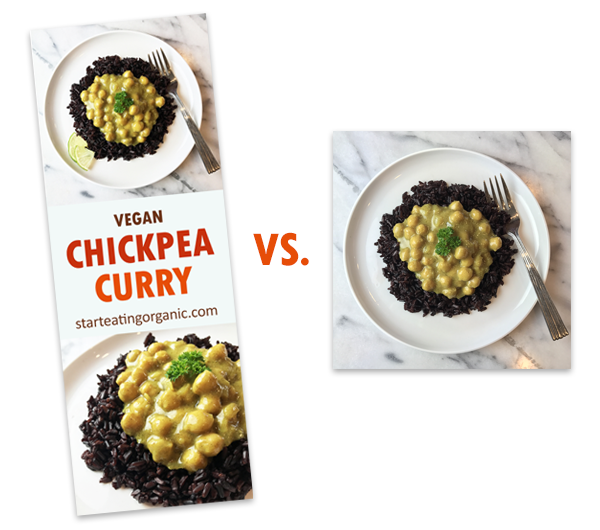
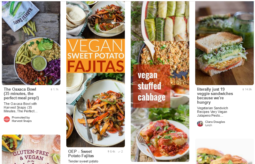
Chances are you have seen those long eye catchy images on Pinterest. They are longer of course and usually contain some sort of text in a block around the middle. And that’s exactly what they are, eye catchy. Long images with text get pinned much more than short images and that’s probably why you’ve been using them or want to use them. As you can see below, the long image grabs your attention, and has much real estate than the short image. I visit many blogs that use these longer images, but some don’t know how to hide the Pinterest image in the WordPress post. I’ll teach you how to hide a long Pinterest image in a WordPress blog post. The image will still be Pinnable of course but will be hidden in the blog post.

So why hide the image? Well, usually they are very long and can disrupt the natural flow of a post, so it keeps the post cleaner. The image itself is easy to make. Just start with a long psd template. Add a square image to the top, and one to the bottom. Then add a colored rectangle in the middle. Add a description of the post, two or three lines, and don’t forget to include your website url. It helps people find your site if the image gets saved elsewhere and keeps correct attribution. Save it, and upload it your WordPress blog post.

You will need the following code:
<div style=”display: none;”>
IMAGE CODE
</div>
Insert the image into the post and then switch from visual mode in the post panel to text mode. Then before the image code, add <div style=”display: none;”>. After the image code, add </div>. And that’s it, don’t add any spaces or anything, just the way it is. So it will look like the following below.

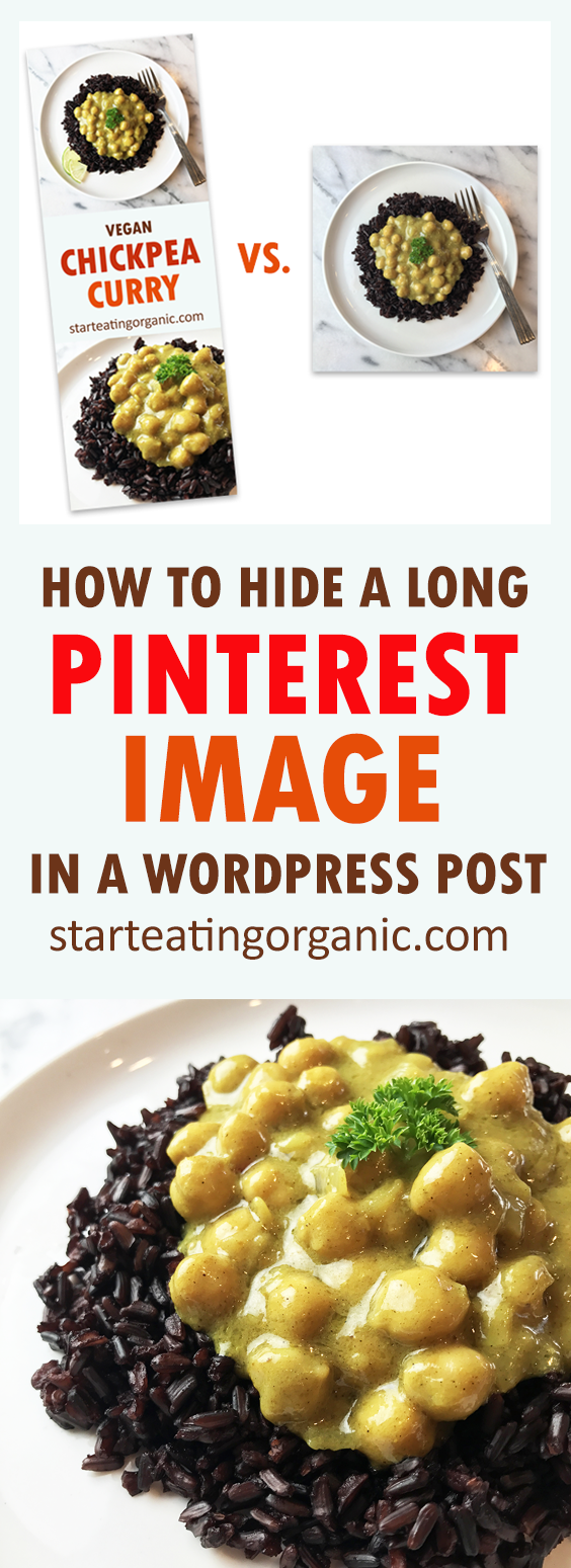
I will mention that between the two apostrophes after the “alt=” is the information that will appear with your pin by default. So, make it count and write something relevant like alt=”Vegan Chickpea Curry Recipe – Creamy, delicious and full of protein & fiber”. When you hit the browser pin button, your long Pinnable image will be there, but completely hidden from the WordPress post. Try it, it’s like magic, except well, it’s programming, so close enough 😀
I did hide a long Pinterest image in this post. You can’t see it, but if you hit the Pinterest button in your browser, it will be there along with the description. So, go forth, and pin merrily my minions!
Updated: I am looking into whether or not this may have a negative impact on SEO. I don’t believe it does if you are not being spammy and hiding keywords & text, as Google usually doesn’t like it when things are hidden, but I am checking into this and will update when I know more.


Okay so I am one who displays the pin pic with a pin button above it in my post. I used to place the image after my focus recipe but have started placing it above to push the focus to the bottom of the post. I also set up the pin pic to be the only pic available when you hit my share buttons. I guess my question is which style is better for SEO and rankings? Check out my site and let me know. I am always happy to get creative criticism. Thanks Quinn
Hi Quinn. That’s an EXCELLENT question. I will update the post to include some info on that and I plan on digging more into it. Well, tbh, there are two camps. One that says do not do this, as any hidden content may get you in trouble with Google. But, there is a second camp that says, as long as you aren’t stuffing it with hidden keywords and being spammy, you should be OK. Of course no one wants to get in trouble with the big G. So if you want to show the image in your post and don’t want to risk it, at least don’t make it the very very long size so your user isn’t scrolling forever. The idea behind this isn’t to change SEO, but for user experience. But I am definitely going to look more into this and update you/the post as you bring up a very valid point!
Oh and I like how your share buttons are configured to pick up on that image and not everything on the site, great idea!
What a great idea! I never thought of those images to be disturbing and taking up too much space but you are totally right! I am going to try that for sure 🙂
xx, Theresa
http://www.primetimechaos.com
Super helpful! Thank you!
I will have to try this…I know that the longer pins are much more eye catching
Thank you for this! The other code I found on an article didn’t work for me. I hope this does!
I have been wondering about this. Interested to know what you find out about the SEO!
I have been looking for some information about this.Thanks for sharing!
This is great advice! I used to do this on all my posts before I changed sharing plugins. It works great and is so easy.
Thanks Kimberly. Which sharing plugin do you use?
This is great advice! I used to do this on all my posts before I changed sharing plugins. It works great and is so easy.
Definitely a great idea! I usually put my Pinterest image right up top, but when people click on my generic pin link, it pins my small featured image instead. I’ll need to fix that, and I’ll have to look into doing this!
Great post. Although this does not work on my WordPress theme 🙁 I might do some digging into it. I have seen many WordPress sites that do that, so it has to work.
Really, that’s so odd. Hmmm…did you place it while in the text tab (and not the visual tab). Sorry if it’s a dumb question, but sometimes it’s the obvious things!
Link exchange is nothing else but it is just placing the other person’s
web site link on your page at proper place and other person will
also do same in support of you.